Progress Global Brand Refresh and Visual Brand Strategy
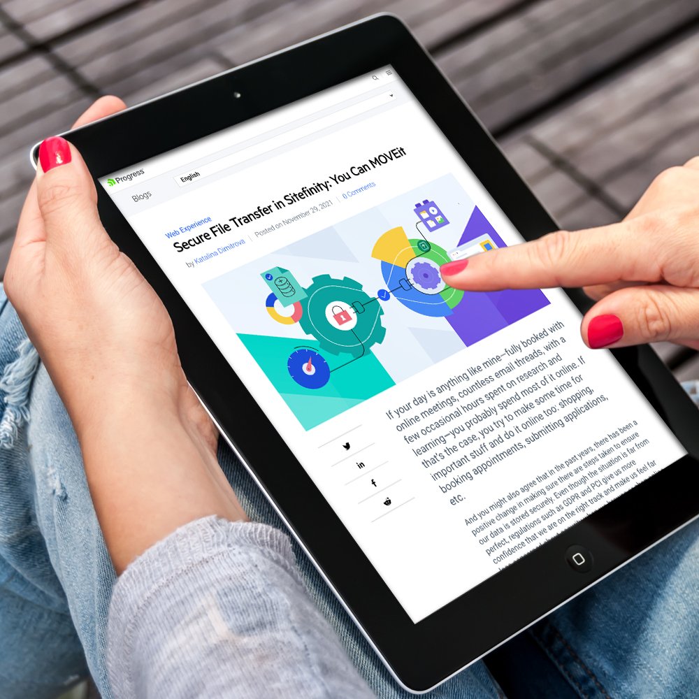
Progress empowers customers to create, deploy, and manage impactful applications seamlessly and securely. After 40 years and growth, the Progress identity needed renewal to reflect its diverse product portfolio. The challenge was to evolve the brand without losing its equity, guided by the new message "Progress That's Built Around You." This involved refreshing the color palette, illustrations, icons, and photography while integrating new brand elements. The aim was a cohesive, modern visual language that unifies product and corporate brands.
CASE STUDY
Role:
Creative Director
Art Director
Brand Strategy
Brand Research
Scope:
Corporate & Product Branding
Illustration
Photography
Design Systems
Video & Motion Graphics
Digital Marketing
Credits:
Art Direction & Design: In-house Team
Research: The Brand Consultancy
Video Art Direction & Production: The Brand Consultancy

VISUAL STRATEGY
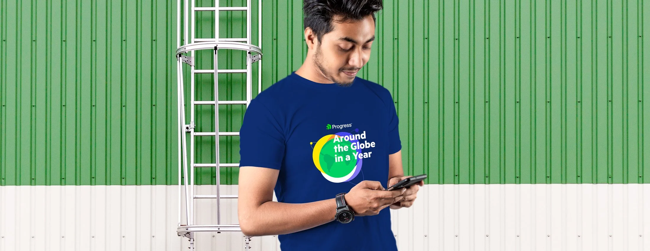
Remaining faithful to the core Progress brand colors, the enhanced palette infuses a vibrant and modern touch. Optimized for digital platforms, these colors offer versatile applications in both corporate and product initiatives, streamlining diverse product branding.
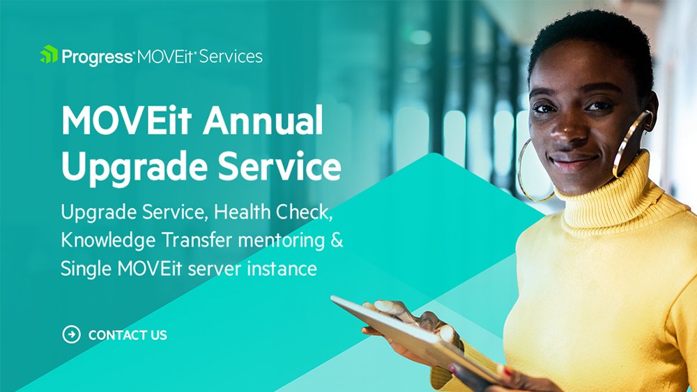
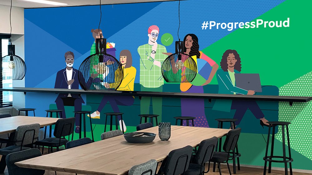
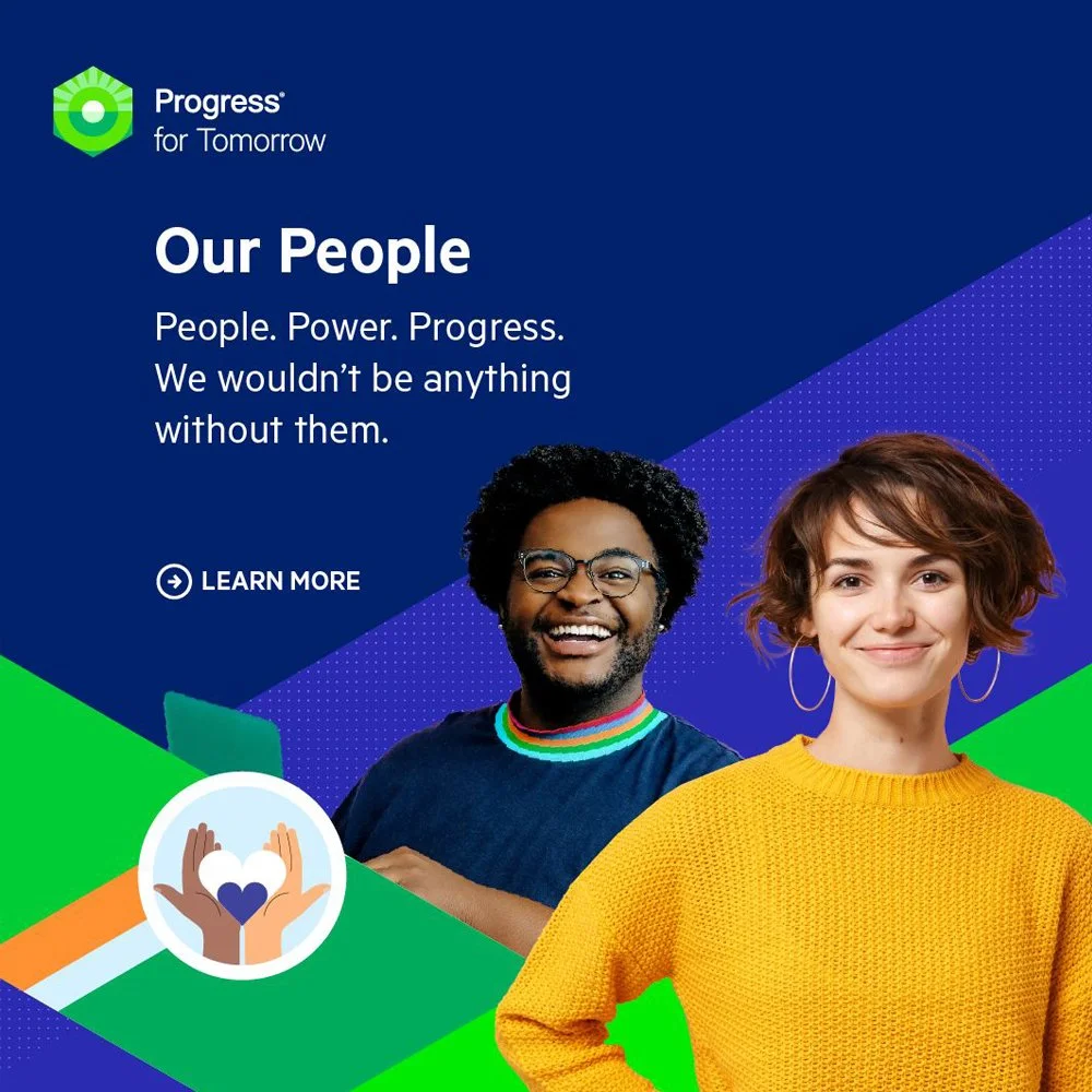
The introduction of Hex Loops and DNA Strands showcases the new brand message while fostering a cohesive set of elements for product synergy. Hex Loops serve as bounding boxes, support features, crop frames, and product markers. Meanwhile, DNA Strands add dynamism to photography, enveloping individuals who embody "Your Progress."


PRODUCT-LEVEL BRANDING
The overall updated corporate branding was then applied across over 6 current business units and applied to new businesses during M&A